You Don't Need a New Component Library for a New Look
A neo-brutalist experiment with Actual CSS, and why I increasingly prefer separating design from component architecture.
A Web Developer based in Belgium, specialized in PHP & JS development
A few weeks ago, I wrote Your Browser Already Has a Component Library. The main argument was simple: before creating another abstraction around a button, checkbox or dialog, we should probably ask what the browser already provides.
Recently, I came across stream/ui, a neo-brutalist component library for React and Tailwind, and my first reaction was that it looked really good. Bold colors, thick black borders, hard offset shadows and playful typography, all brought together into a cohesive visual language. Everything feels carefully designed, from the smallest badge to the larger page sections, and the attention to interactive states is particularly nice. It's the kind of project that makes you want to build something with it.
But after browsing the components, I found myself asking a slightly different question: if all I want is that visual style, why would I need a new component library?
A small experiment
I've been working on Actual CSS, a CSS framework built around semantic HTML, reusable classes, design tokens and progressive enhancement. It has its own visual defaults, but those aren't supposed to define what applications built with it must look like. The idea has always been to provide a foundation that can accommodate different visual directions without forcing applications into a particular design language.
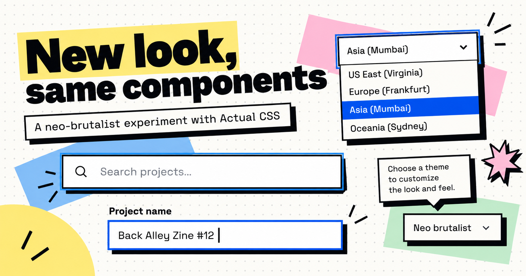
So I decided to try something. Instead of installing Stream UI or recreating its React components, I built a neo-brutalist demo using Actual CSS. The result is a fictional risograph printing studio called Plate&Pulp, with buttons, cards, alerts, forms, tables, progress indicators, accordions, a dialog and various other UI elements. Not just a collection of isolated component previews, but an actual page with a consistent visual identity.
I was pleasantly surprised by how well it worked. The result doesn't reproduce Stream UI exactly, nor was that the goal. It's my own take on the same aesthetic, but the interesting part is that I didn't need to replace my existing components to get there. The buttons are still Actual CSS buttons, the cards still use the same classes, the accordion still uses native <details> elements, and the dialog is still a native <dialog>.
For example, the primary action is still just:
<button class="btn primary">
  Start a print run
</button>
The visual treatment comes from CSS, not from introducing a new button API. The same HTML conventions can produce a fairly conventional business interface or something loud and playful, and switching between those visual directions doesn't require rebuilding the underlying components.
That's exactly what I wanted to test.
A design language is not a component architecture
Looking at Stream UI, what first caught my attention wasn't its React API. It was the visual language: the colors, the borders, the shadows, the typography and the way controls react when you interact with them. Those are primarily design decisions, even if a component library is a convenient way to package and distribute them.
Stream UI does more than styling, of course. It provides ready-made sections, icons, animations and interactive components, and if you're already building with React and Tailwind, that convenience is genuinely useful. But I think we sometimes treat the implementation model and the design as if they were inseparable, when they really don't have to be.
Want a Material-inspired interface? Install a Material component library. Want a shadcn-style interface? Adopt that component system. Want neo-brutalism? Here's another set of components. Each library comes with its own conventions, APIs, dependencies and ways of doing things. There's nothing inherently wrong with that approach, but if the main motivation is visual, it seems like a lot of architectural commitment for something CSS was designed to handle.
A button doesn't need to become a different kind of button because its border is now two pixels thick and its shadow has no blur. Similarly, a checkbox shouldn't need a completely different component API just because the design calls for a colored background and a hard black outline.
The appearance of a component and the way an application interacts with it are related concerns, but they don't necessarily need to be implemented together.
It's not just changing a few variables
I should be fair about the experiment: the neo-brutalist theme isn't just ten CSS variables. It contains several hundred lines of CSS, including component-specific adjustments, and that's completely reasonable. A convincing design language needs more than colors and border radii, especially when it introduces strong visual treatments that affect how components behave across different states.
Hard shadows, for example, introduce interesting questions. What happens to a button when it's hovered, pressed or disabled? Should a card nested inside another card cast its own shadow? What about adjacent controls that share a border? These details matter because the visual language needs to remain consistent beyond a few carefully selected screenshots.
A neo-brutalist interface also needs carefully considered focus states. In my demo, I actually ended up preferring some of the field focus treatments to the ones I had initially admired in Stream UI. That's a subjective design preference, of course, not an accessibility benchmark, but it was a useful reminder that visual details can be developed and improved independently of a component's implementation.
None of these problems magically disappear because you're using React. They still have to be solved somewhere, whether that's inside a component library, a theme or application-specific styles. The important distinction isn't whether the styling is complex. It's where that complexity lives.
In this experiment, most of it lives in a theme stylesheet. The underlying markup, semantics and component conventions remain the same, which means I can remove the theme tomorrow, switch to something completely different, and most of the application won't even notice. That's a very different proposition from changing the component system an application is built around.
Good CSS hooks make this possible
This experiment also made me appreciate something that isn't always obvious when designing a CSS framework: the value of well-placed customization hooks. A framework doesn't have to anticipate every possible design, but it should avoid making reasonable customization unnecessarily difficult.
For example, if a control exposes appropriate tokens for its border, background, shadow and focus treatment, a theme can change its personality without replacing its markup. For more opinionated aesthetics, some targeted selectors are still necessary, and that's fine too. The objective isn't to make every design possible through configuration variables alone, because that quickly becomes another abstraction problem, with dozens of options trying to anticipate every conceivable variation.
What matters is having a stable foundation that can be extended with ordinary CSS. Sometimes that means overriding a token, sometimes it means adding a component-specific rule, and sometimes it means writing a completely custom component. None of those choices should force the rest of the application to adopt a different set of conventions.
This is also why I believe a CSS framework should make it possible to replace individual components without abandoning the system. If a particular implementation doesn't suit your needs, you should be able to write your own while keeping the familiar markup conventions, state classes and design tokens where they make sense.
I find that much more appealing than treating every component implementation as something the application must adopt wholesale. The framework provides a common language, not a collection of decisions that can never be questioned.
The details matter, too
While building the demo, something else surprised me. I initially approached the experiment as a visual exercise, expecting to reproduce a particular aesthetic with my existing components. But as I started comparing the interactions, I realized that some of the details I preferred were actually coming from Actual CSS itself, rather than from the neo-brutalist theme.
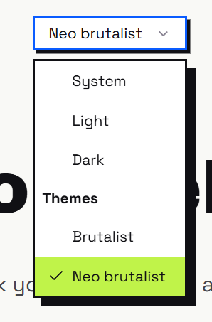
Take the select component, for example. Stream UI uses a native HTML select, which is a perfectly reasonable choice. It provides the familiar platform picker, keyboard navigation and accessibility behavior without having to recreate them. Actual CSS also starts with a native select, but progressively enhances it using the newer CSS appearance: base-select functionality. On supporting browsers, this allows the dropdown, options, selected indicator and focus states to be styled consistently with the rest of the interface. On other browsers, or in environments where the enhancement isn't appropriate, the native picker remains available. I particularly like this approach because it gives us more control over the design without sacrificing the underlying platform behavior.
The focus treatment was another pleasant surprise. Stream UI uses a prominent outer outline around its field containers, combined with a stronger shadow. Actual CSS uses an inset :focus-visible outline that stays within the control's border box, preserving the hard offset shadow and avoiding interference with adjacent controls. I personally find the result cleaner, especially in a design where strong borders and shadows are already doing a lot of visual work. More importantly, that behavior comes from the framework's shared form controls, not from something I had to reinvent for the demo.
Tooltips are perhaps an even better example of where the underlying implementation matters. Stream UI provides a straightforward React tooltip with hover and focus handling, keyboard dismissal and accessible descriptions. Actual CSS takes a more elaborate approach, using a small JavaScript enhancement powered by @lekoala/floating. Tooltips can automatically flip or shift when they approach viewport boundaries, follow their triggers during scrolling and use the browser's popover top layer to avoid many common clipping and stacking problems. The behavior also accounts for contexts such as fixed elements and modal dialogs. Those are details you might not notice in a static component gallery, but they make a real difference once you start using components throughout an application.
To be clear, these aren't reasons to declare one library universally better than another. Stream UI is focused on delivering a distinctive set of React components, and not every project needs an elaborate tooltip positioning system or customizable native select menus. Actual CSS has its own complexity, too, including JavaScript where browser behavior alone isn't sufficient. But the comparison reminded me that a component's value isn't limited to how it looks. There's a lot of engineering in the details of how it behaves, how it adapts to different contexts and how gracefully it falls back when a newer browser feature isn't available.
And that's another reason I prefer keeping the visual language separate from the underlying components. I can experiment with a completely different aesthetic while retaining the interaction details that have already been designed, tested and refined. Instead of choosing between a particular look and a particular set of behaviors, I get to keep both.
This isn't an argument against Stream UI
I want to be clear about something: Stream UI does its job well. It offers a coherent visual system, ready-to-use React components, page sections and interactive details. Its design is distinctive, and the effort behind it shows. For someone already using React and Tailwind who wants exactly this aesthetic, it's an attractive option, and I can absolutely understand choosing it.
There are also legitimate reasons to adopt component abstractions beyond appearance. Complex state management, advanced keyboard interactions, composition APIs, integration with an existing framework or simply the convenience of ready-made implementations can all provide real value. Building those things yourself isn't always desirable, and there's no particular virtue in avoiding a dependency when that dependency genuinely solves a problem.
My objection isn't to React components, or to component libraries in general. It's to the idea that adopting a new visual style should naturally mean adopting a new component model, because those are two different decisions.
If an application already has working buttons, forms, dialogs and navigation, I would much rather change their presentation than replace them just to achieve a particular aesthetic. That applies whether the application uses React, Vue, Symfony with server-rendered templates or plain HTML. In fact, that's one of the things I like about staying close to the platform: the same CSS can work across all of them.
The freedom to change your mind
There's another benefit to this separation that I think deserves more attention: visual trends change. Neo-brutalism is appealing today, but tomorrow I might want something softer, more restrained, more editorial or simply more appropriate for a dense administrative interface.
If the visual language is strongly coupled to the component architecture, changing direction can become a much bigger project than it needs to be. A redesign might involve replacing components, adapting their APIs, revisiting interactions and reworking parts of the application that have nothing to do with its appearance.
But if the foundation consists of semantic HTML, stable conventions, a reasonable set of CSS components and a theme layer, changing the design becomes a much more contained exercise. Not necessarily effortless, because a good redesign still requires work, but it shouldn't require rethinking how a form submits, how a dialog opens or how a checkbox participates in the document.
Those behaviors have very little to do with whether the interface looks like a corporate dashboard or a punk gig poster. Keeping them independent of the visual language gives you considerably more freedom to experiment, evolve and, perhaps most importantly, change your mind later.
Keep the components. Change the design.
My previous article was mostly about behavior: why recreate browser features when HTML already provides them? This experiment made me think about the other side of the equation: presentation.
We have incredibly capable CSS today. Custom properties, modern selectors, container queries, logical properties and increasingly powerful native controls give us a lot of room to build distinctive interfaces without introducing a new runtime abstraction for every visual choice. That doesn't eliminate the need for component libraries, and it certainly doesn't mean every design can be achieved by changing a handful of colors. But it does make me question how often we package visual decisions together with architectural ones.
Stream UI is a great example of a strong aesthetic translated into a coherent component library, and I genuinely like what it has done. I just discovered that, for my own projects, I would rather reproduce that kind of aesthetic on top of a foundation I already use and understand.
Not because the alternative is bad, but because I don't want my choice of design to dictate my choice of technology.
Sometimes you don't need a new component library. You just need a new theme.
See the live neo-brutalist demo, explore Actual CSS, or check out stream/ui for the design that inspired this experiment.