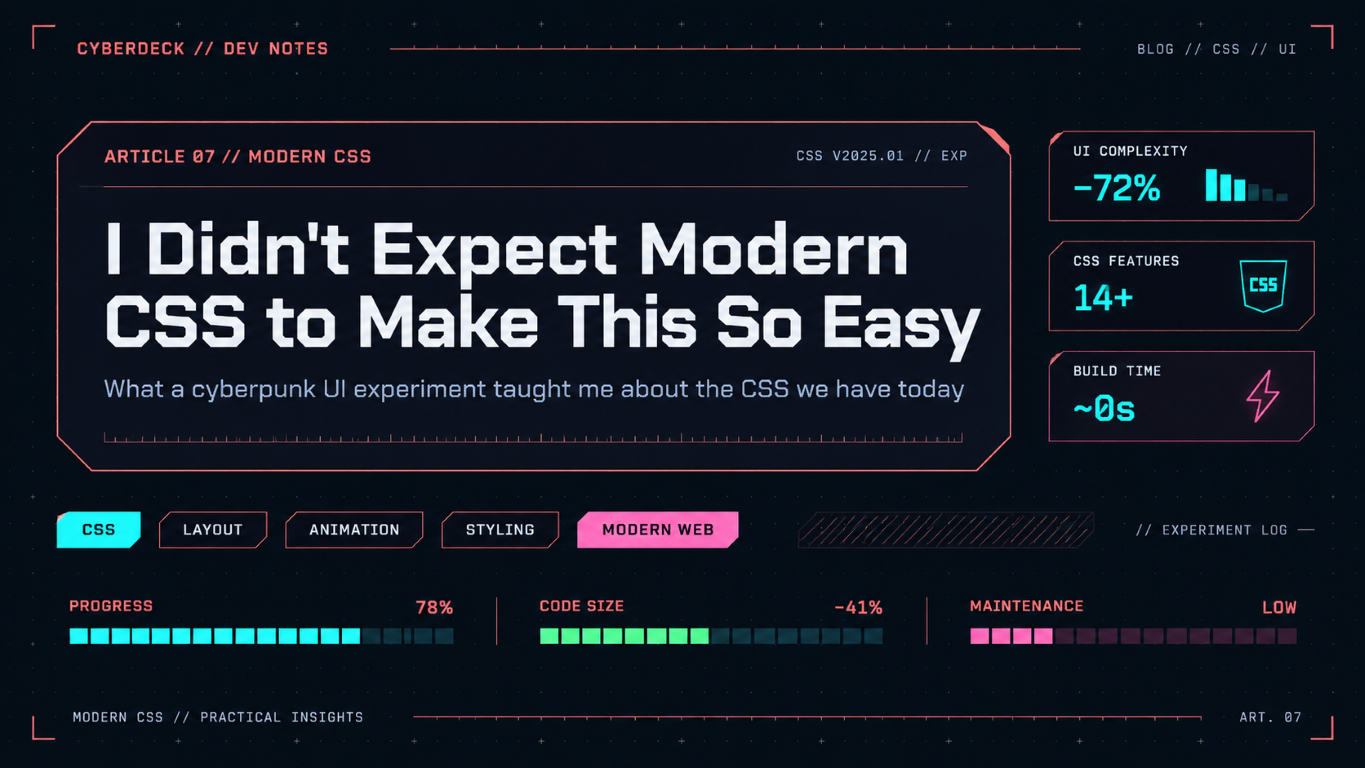
I Didn't Expect Modern CSS to Make This So Easy
What a cyberpunk UI experiment taught me about the CSS we have today.
I recently came across CyberSpec, an incredibly detailed cyberpunk UI library.
And I was genuinely impressed.
Every component looks like it belongs to the same fictional machine. Buttons have clipped corners and tiny tabs along their edges. Switches display ON/OFF labels inside their tracks. Panels look like pieces of futuristic hardware. There are technical markings, segmented gauges, glowing indicators, and carefully designed interaction states everywhere.
It's not just neon colors on a dark background. The attention to detail is remarkable.
My first thought was that reproducing this kind of interface would involve a lot of complicated CSS. Custom SVGs for the frames, pseudo-elements fighting with borders, perhaps even some JavaScript just to get the geometry right.
But I was curious how far I could go with modern CSS.
So I tried building something similar with Actual CSS, the CSS framework I've been working on.
The result is Cyberdeck, a fictional relay station console with beveled panels, technical controls, segmented meters, diamond-shaped indicators, and all the little visual details that make a science-fiction interface feel convincing.
And what surprised me wasn't just that it worked.
It was how straightforward much of it turned out to be.
The bevel that changed my mind
The biggest surprise was probably corner-shape.
For years, if you wanted a box with clipped corners, you had a few options. You could use clip-path, build the corners with pseudo-elements, draw an SVG, or get creative with gradients.
All perfectly valid techniques, but they came with compromises.
A clip-path could give you the desired silhouette, but what about the border? Or the box shadow? Or the focus outline? Suddenly, something as simple as a button with a diagonal corner needed considerably more thought.
Now, in supporting browsers, you can write:
.panel {
  border-radius: 12px;
  corner-shape: bevel square;
}
That's it. It's all you need to get:\

The top-left and bottom-right corners are beveled, while the other two remain square.
More importantly, the browser handles the geometry. Borders, shadows, backgrounds, and outlines follow the shape rather than requiring separate drawings.
That last part is particularly valuable for interactive controls. You can give a button a distinctive silhouette without having to reinvent its focus indicator.
In Cyberdeck, I applied corner-shape through the existing radius tokens. The theme uses beveled corners on panels, inputs, buttons, badges, and even some smaller indicators.
There was one amusing discovery: applying bevels indiscriminately to elements with large border radii can produce some very strange shapes. A pill can become a hexagon, which is great. But certain asymmetric cuts on small circular elements can collapse them into something resembling a diagonal line.
So there are still design decisions to make. But I was dealing with which corners should be beveled, rather than how do I draw a bevel without breaking everything else?
That's quite a difference.
corner-shape is not supported everywhere yet. Cyberdeck handles this with a simple fallback: unsupported browsers get square corners.
[data-theme="cyberdeck"] {
  --radius: 0;
}

@supports (corner-shape: bevel) {
  [data-theme="cyberdeck"] {
    --radius: 0.5rem;
  }
}
No polyfill or alternative SVG implementation is necessary. The interface simply looks slightly less futuristic in some browsers, while remaining perfectly usable.
Making colors work together
Color manipulation was a more familiar part of the experiment.
I've been using OKLCH for years. Back in 2023, I even wrote about building a pure CSS color palette using OKLCH. So this wasn't a discovery of the color space itself, but rather another opportunity to see how naturally it fits into a more elaborate visual system.
Cyberdeck uses two main hue values: one for the interface's technical chrome, and another for its signal color.
--deck-hue: 22;
--deck-signal-hue: 195;

--deck-chrome: oklch(
  73% 0.16 var(--deck-hue)
);

--primary: oklch(
  86% 0.14 var(--deck-signal-hue)
);

--deck-line: color-mix(
  in oklab,
  var(--deck-chrome) 45%,
  var(--surface)
);
From there, borders, control states, subtle backgrounds, and highlights derive their colors from shared roles.
There's a small distinction worth mentioning here: I use OKLCH to define colors, because lightness, chroma, and hue are intuitive controls, but OKLab to mix them. When blending an accent into a dark surface, OKLab tends to produce a more subdued intermediate color rather than traveling around the hue wheel and introducing an unexpected hue. If I wanted a colorful transition between hues, OKLCH might be the better choice.
It's a subtle difference, but useful when building a palette with lots of tinted surfaces and borders.
The interesting part isn't any particular color function. It's how those functions work alongside the geometry, the interaction states, and the component tokens to keep the whole interface consistent.
There was still a useful limitation to rediscover. When I applied Cyberdeck to an existing fictional restaurant website called Neon Ramen, its pink brand color looked too pastel with the same lightness settings that worked beautifully for cyan. So I adjusted the primary color directly.
A hue value alone isn't a complete brand identity, and no color space will automatically make every combination aesthetically pleasing. But having the color logic live directly in CSS makes this kind of experimentation remarkably convenient.
All those tiny details
What I particularly admire about CyberSpec is that its identity comes from hundreds of small decisions. And those are often the details we assume will be difficult to reproduce.
Take segmented gauges, for example. Here is the current state:

I wanted native <progress> and <meter> elements to look like rows of individual illuminated cells. The solution was largely a CSS mask:
.progress,
.meter {
  mask:
    linear-gradient(
      90deg,
      #000 calc(100% - 3px),
      transparent 0
    )
    0 0 / 1.25rem 100% round no-repeat;
}
The interesting part is round. Instead of cutting off the last cell when the available width doesn't divide evenly, the browser adjusts the repeated pattern to fit a whole number of cells. The underlying value is still drawn by the browser's native progress or meter implementation. The mask simply changes how that value is presented.
Other details followed the same pattern. Disabled buttons use repeating gradients to produce diagonal hatching. Range inputs have fine graduations drawn with background gradients. Radio buttons become diamonds. Card links reveal targeting brackets on hover or keyboard focus. Panel headers and footers are separated by thin technical rules.
Even the switches display their state inside the control.
.switch::after {
  content: var(--deck-switch-off) / "";
}

.switch:checked::after {
  content: var(--deck-switch-on) / "";
}
The labels are decorative: the native checkbox, with switch semantics, still exposes its actual state to assistive technology.
None of these techniques is particularly revolutionary on its own. Gradients, pseudo-elements, masks, and custom properties have been around for a while. Some of them are old friends.
What surprised me was how naturally they could now be combined with newer CSS features to produce such a detailed interface, and how little JavaScript was required for the appearance itself.
Where CSS still pushed back
Of course, I don't want to give the impression that the entire experiment was effortless. Cyberdeck ended up being a fairly substantial stylesheet, around 740 lines of CSS, and a coherent design language takes work regardless of how capable the browser becomes. There were also a few interesting problems along the way, particularly when dealing with native form controls.
Range sliders, progress bars, and meters expose browser-specific pseudo-elements for their tracks, thumbs, and filled portions. Applying a general theme rule doesn't necessarily reach those internal pieces, which meant I initially needed vendor-specific overrides just to make their corners consistent. At one point, one of those overrides even interfered with the focus treatment of the range slider.
Interestingly, this revealed a limitation in Actual CSS rather than a fundamental problem with the approach. Some of those shapes were still tied directly to the framework's generic radius tokens, making it unnecessarily difficult for a theme to change their geometry. Introducing a few targeted hooks, such as --bar-radius, --range-thumb-radius, and --range-thumb-inline-size, solved the problem without requiring every theme to duplicate browser-specific selectors.
I actually enjoyed this part of the experiment. Pushing a design system toward an extreme visual style is a good way to discover where its abstractions are too restrictive. A conventional theme might never reveal those limitations, simply because it doesn't challenge the underlying geometry.
There were also a few details that genuinely needed JavaScript. The demo, for instance, displays small character counters such as 02/04 beside some fields and highlights the next OTP cell to receive input. CSS can style those elements, but it doesn't provide a general mechanism for reading an input's current value, formatting its length, and identifying the next cell.

A small script handles that, while the native inputs continue doing their job. I wasn't trying to prove that JavaScript is unnecessary, only to explore how much of the visual language could be expressed directly in CSS. In that respect, the result exceeded my expectations.
Modern CSS doesn't mean ignoring other browsers
One decision I made early on was to treat Cyberdeck as an experiment for modern browsers rather than trying to reproduce every detail across every browser version. That gave me the freedom to use features such as :has(), color-mix(), OKLCH, masks, and corner-shape without spending most of the development time building elaborate fallback implementations.
That doesn't mean compatibility or accessibility became secondary concerns. It simply meant distinguishing between visual enhancements and essential functionality. If a decorative corner becomes square in an unsupported browser, I consider that perfectly acceptable. The same goes for a missing glow or a less elaborate transition. Losing a visible focus indicator, obscuring an input's state, or making a control unreadable would be a different matter entirely.
The experiment therefore included tests in Chromium, Firefox, and WebKit, along with checks for keyboard focus, forced colors, and reduced motion. I wasn't aiming for identical screenshots across engines, but for an interface that remained usable while taking advantage of newer capabilities wherever they were available.
This is one aspect of progressive enhancement that I think deserves more attention. We often discuss it in terms of JavaScript, where an interface starts with functional HTML and gains additional behavior when scripts are available. But the same principle applies to presentation. Modern CSS makes it possible to offer a richer visual experience without necessarily maintaining a completely separate styling implementation for older browsers.
Sometimes the best fallback is simply a less elaborate design.
The unexpected benefit
There was another result I hadn't anticipated when I started experimenting with Cyberdeck.
Neon Ramen, an existing demo site built with Actual CSS, already had its own cyberpunk-inspired styling. It included custom clipped corners, specially styled buttons, handmade focus treatments, decorative brackets, and several other details that gave it a distinctive identity. When I switched it over to Cyberdeck, I could remove 154 lines of site-specific CSS because the theme already provided those elements in a consistent way.
I find that especially satisfying because the original goal was purely visual. I wanted to see whether I could recreate the feeling of a highly detailed science-fiction interface, not necessarily improve the architecture or reduce the amount of custom styling in another project. Yet the experiment ended up doing both.
It also reinforced something I've noticed while working on Actual CSS: a design system becomes more flexible when its components expose the right customization points, but finding those points isn't always obvious. Sometimes you need to attempt something deliberately unusual to discover what should have been configurable all along.
Of course, this doesn't mean Cyberdeck is somehow a 20-line CSS trick. The theme itself contains plenty of dedicated styling, and the demo still has its own typography, content, and decorative details. I wouldn't claim that CSS has suddenly made sophisticated interface design trivial.
What has changed is the nature of the work. More of my time went into deciding how things should look, how states should communicate meaning, and how the various details should fit together. Much less of it went into working around the browser to make those decisions possible.
That was the unexpected benefit of the whole exercise.
Maybe we should experiment more
I've been writing CSS for a long time, and I've followed its evolution closely enough to know about most of the features used here. I was already familiar with OKLCH, comfortable with custom properties and gradients, and aware of the newer possibilities offered by selectors and browser-native styling.
But knowing that individual features exist isn't quite the same thing as discovering what they make possible when combined.
Before trying Cyberdeck, I would have assumed that reproducing something inspired by CyberSpec would involve a fair amount of custom graphical work and complicated styling techniques. Instead, I found myself mostly choosing colors, adjusting geometry, layering backgrounds, designing interaction states, and refining small visual details. There were technical challenges, certainly, but they rarely felt like fundamental limitations of the platform.
I also came away with an even greater appreciation for the work behind CyberSpec itself. The technology is only part of what makes that interface impressive. The real achievement is the consistency of its visual language, from the largest panels down to the smallest control states. Cyberdeck is my own interpretation of that aesthetic, built with Actual CSS rather than a port of CyberSpec's components, and the experiment owes a lot to that original inspiration.
Perhaps that's the most interesting lesson here. Modern CSS doesn't necessarily reduce the amount of design work required to build something distinctive, but it increasingly lets us express those decisions directly, without needing a complicated workaround for every unusual shape or detail.
I knew CSS had become more powerful. What I hadn't fully appreciated was how much more enjoyable that could make the process of building an interface.
And perhaps the best way to discover that isn't to read another roundup of new CSS features, but to pick a design that looks unreasonably complicated and see what the browser can already do.
Explore the Cyberdeck demo source, the Actual CSS project, or the excellent CyberSpec that inspired the experiment.
About the author
A Web Developer based in Belgium, specialized in PHP & JS development
Comments
Join the discussionNo comments yet. Be the first to comment.